Baijiu Pairing Bar
Honglin
Honglin
Category
Food, Baverage, Branding
Scope of Work
Brand Design, Editorial Design, Photography
Food, Baverage, Branding
Scope of Work
Brand Design, Editorial Design, Photography
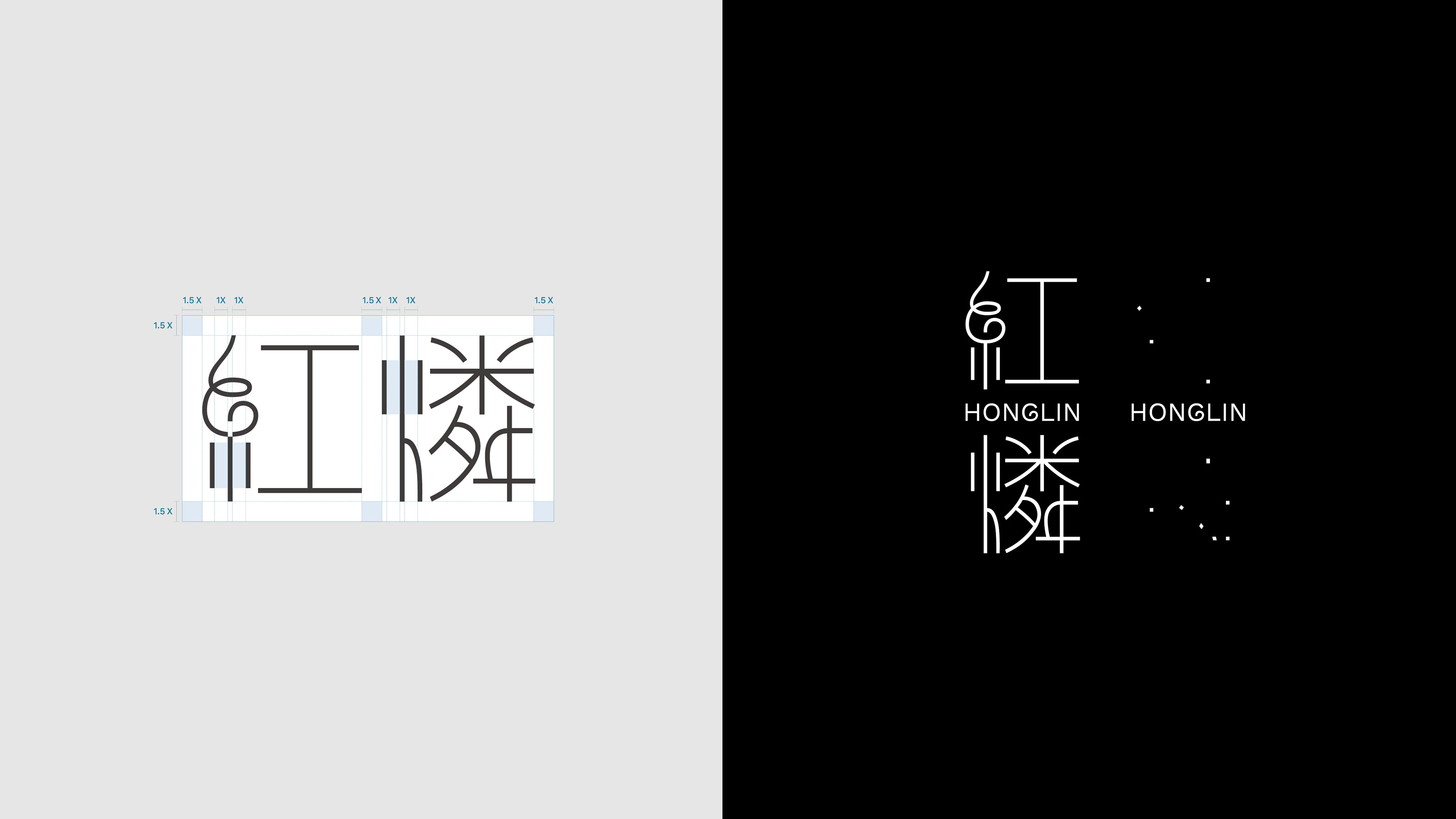
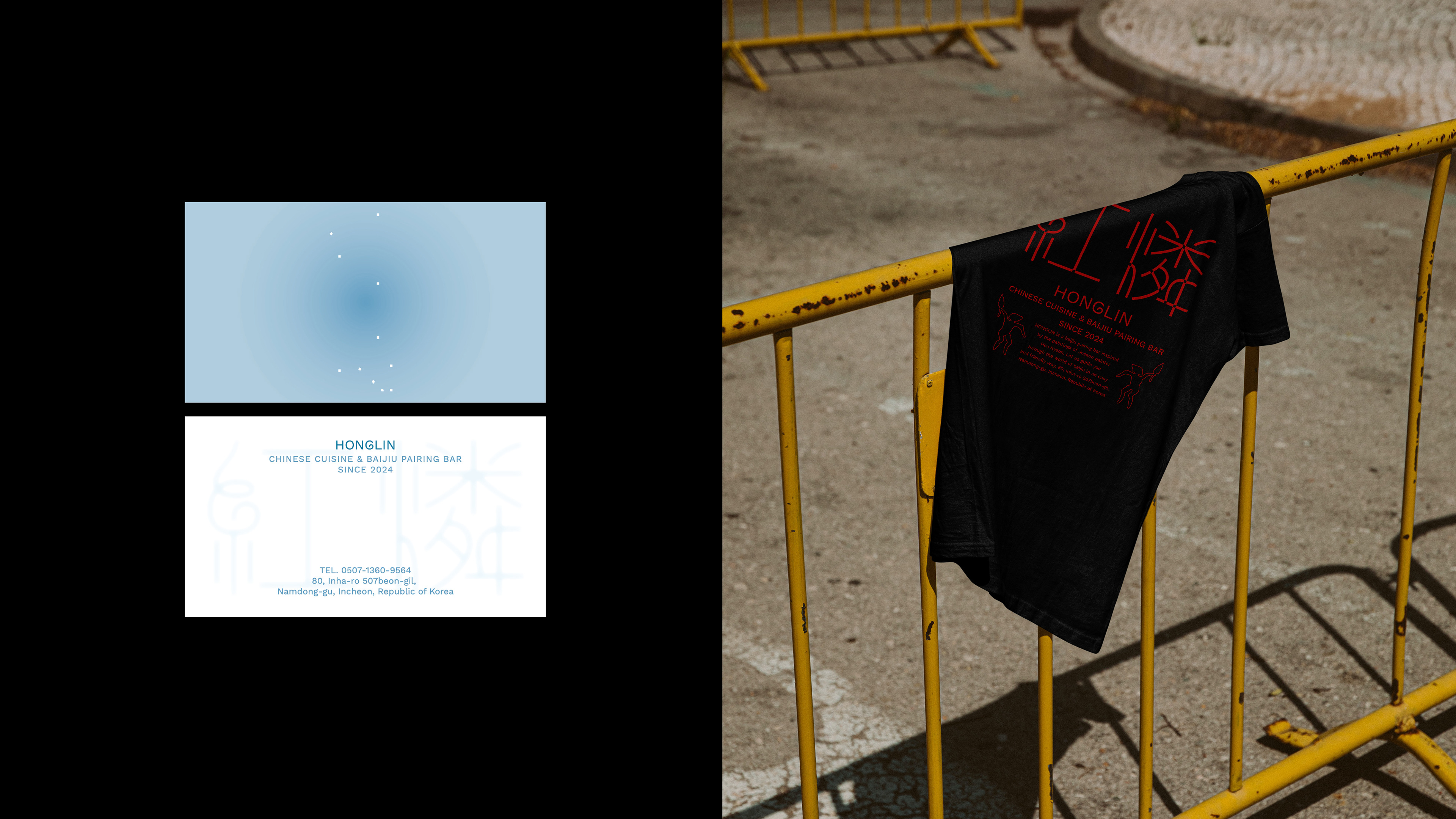
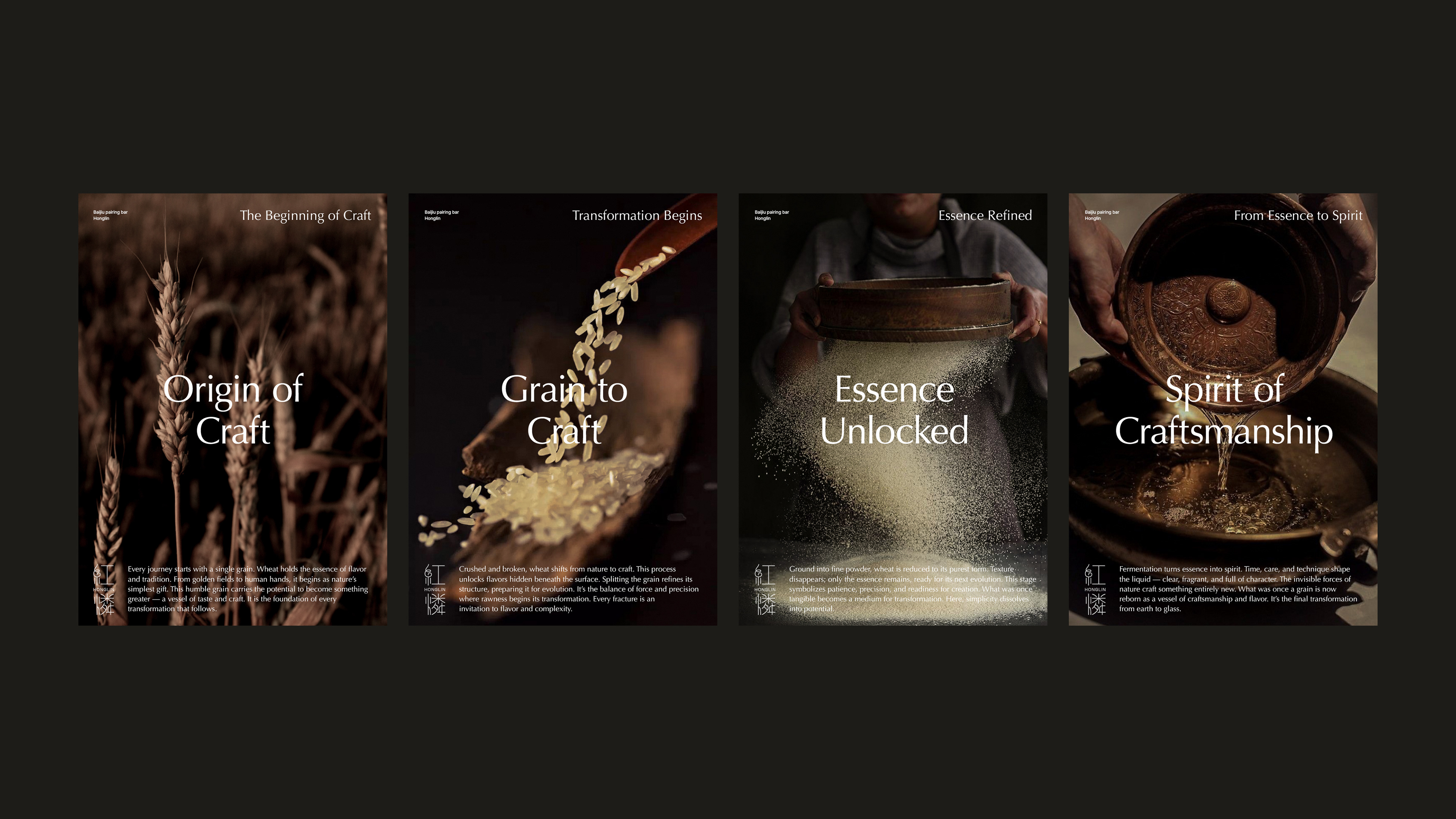
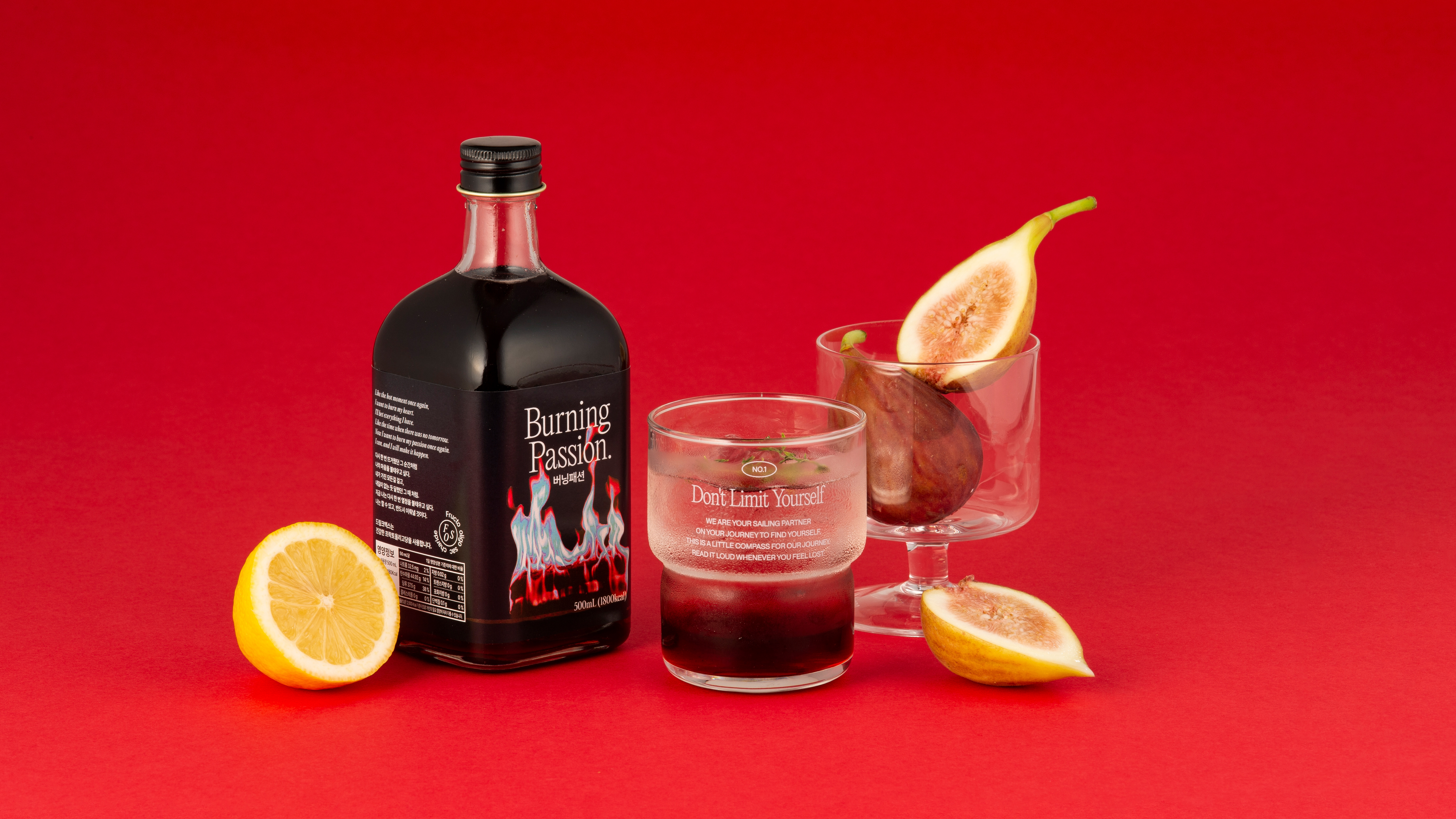
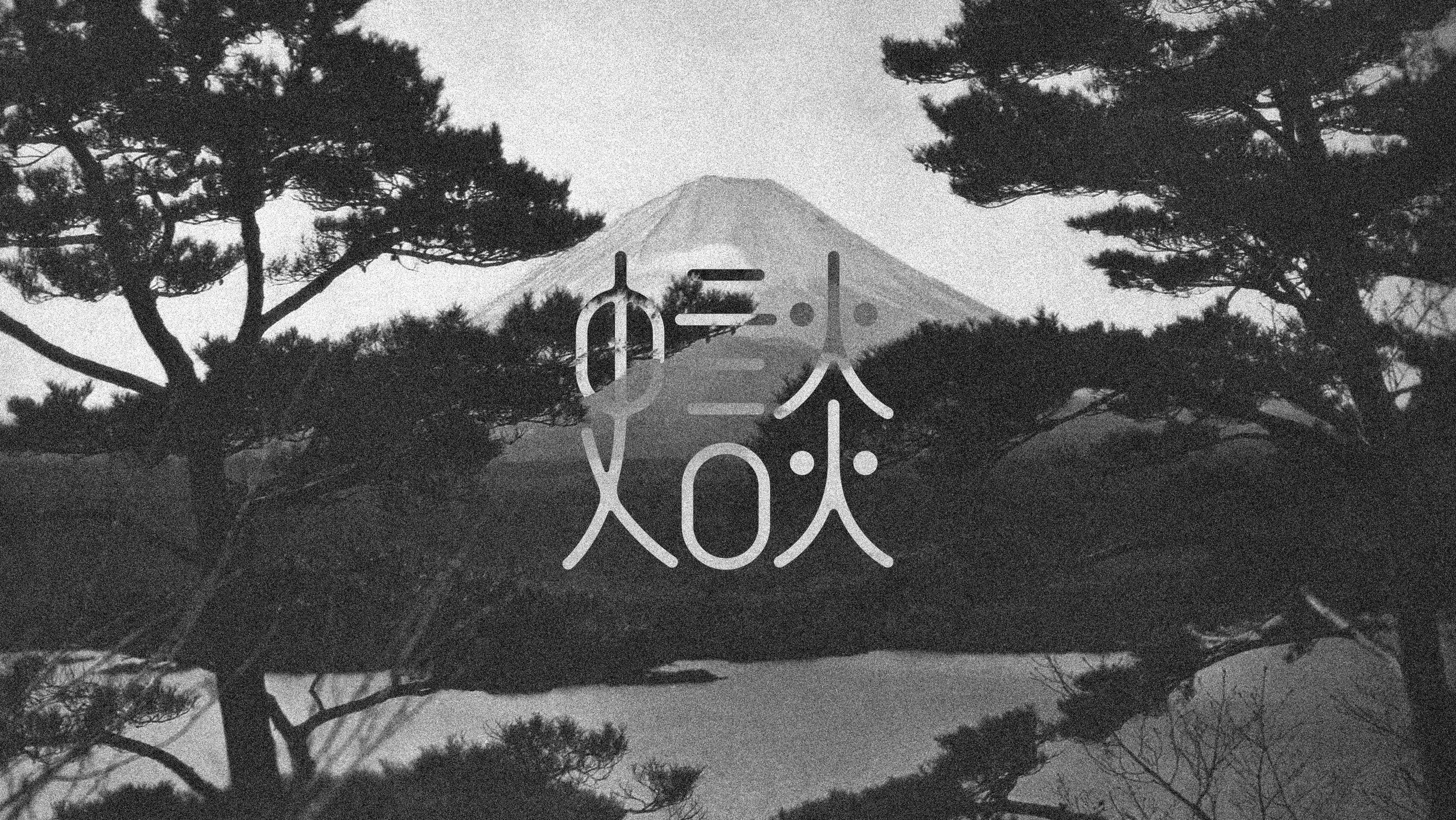
‘Honglin’ is a baijiu pairing bar whose name was inspired by the elusive form of a will-o’-the-wisp—an unfamiliar yet inherently Eastern presence. The wordmark translates this atmosphere into a visual language, focusing on both the structural depth of the Chinese characters and the fluid motion of fire.
Rather than a purely typographic exercise, the form of each character was carefully constructed to reflect the rhythm of flames through the direction, spacing, and breathing room between strokes. This captures the essence of what Hongrin offers—a flowing sequence of spirits and dishes, the harmony of fire and flavor, and a quiet sense of hospitality that simmers at a low temperature.
‘홍린’은 도깨비불의 형상에서 착안한 이름으로, 낯설지만 익숙한 동양적 기운을 시각 언어로 풀어낸 백주 페어링 바입니다. 이번 워드마크는 브랜드명에 담긴 한자어의 구조적 깊이와 불의 유동성을 동시에 표현하는 데 초점을 맞췄습니다. 한자의 형태는 단순한 인쇄용 조형을 넘어, 획의 방향성과 간격, 그리고 그 사이의 여백을 통해 불꽃의 흐름과 정제된 긴장감을 구현했습니다. 이는 홍린이 지향하는 바—술과 안주가 이어지는 리듬, 불과 맛의 조화, 그리고 낮은 온도의 정중한 환대—를 시각적으로 상징합니다.
‘홍린’은 도깨비불의 형상에서 착안한 이름으로, 낯설지만 익숙한 동양적 기운을 시각 언어로 풀어낸 백주 페어링 바입니다. 이번 워드마크는 브랜드명에 담긴 한자어의 구조적 깊이와 불의 유동성을 동시에 표현하는 데 초점을 맞췄습니다. 한자의 형태는 단순한 인쇄용 조형을 넘어, 획의 방향성과 간격, 그리고 그 사이의 여백을 통해 불꽃의 흐름과 정제된 긴장감을 구현했습니다. 이는 홍린이 지향하는 바—술과 안주가 이어지는 리듬, 불과 맛의 조화, 그리고 낮은 온도의 정중한 환대—를 시각적으로 상징합니다.