
Shidan
Brand Identity Design
Brand Identity Design
Category
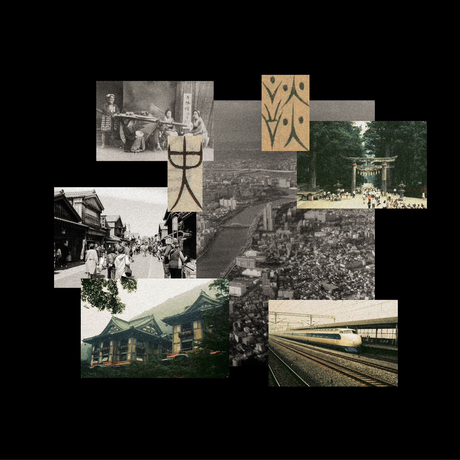
Local, Japan Regional Club, History
Scope of Work
Brand Identity Design
Local, Japan Regional Club, History
Scope of Work
Brand Identity Design
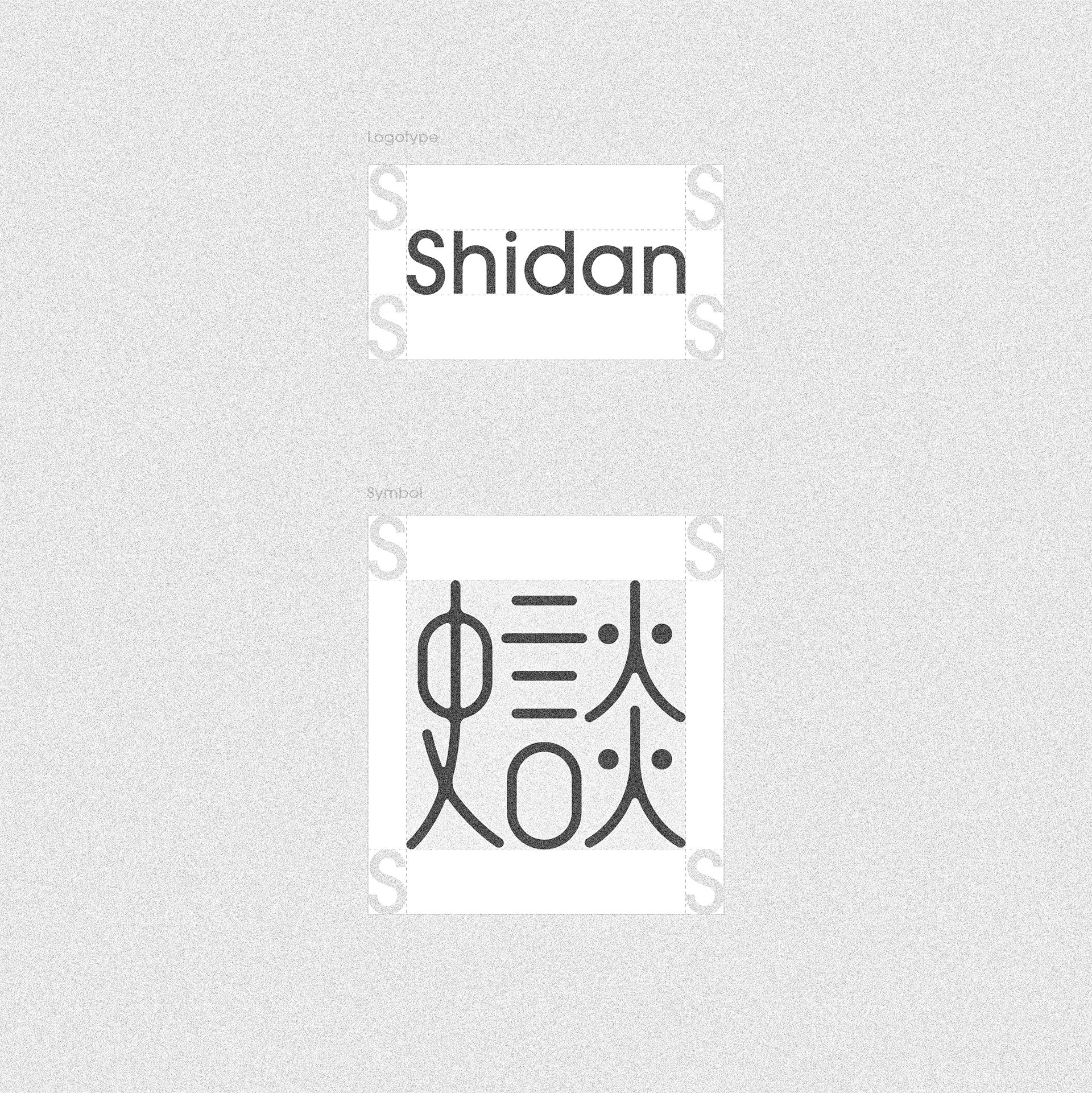
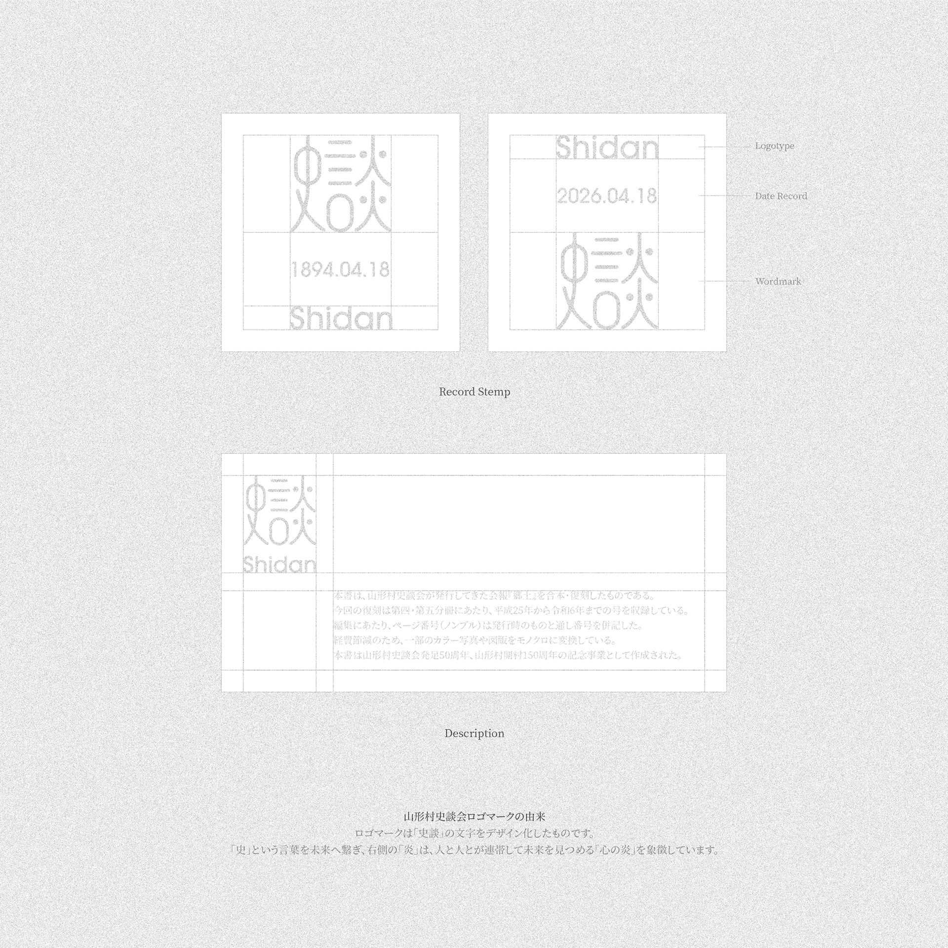
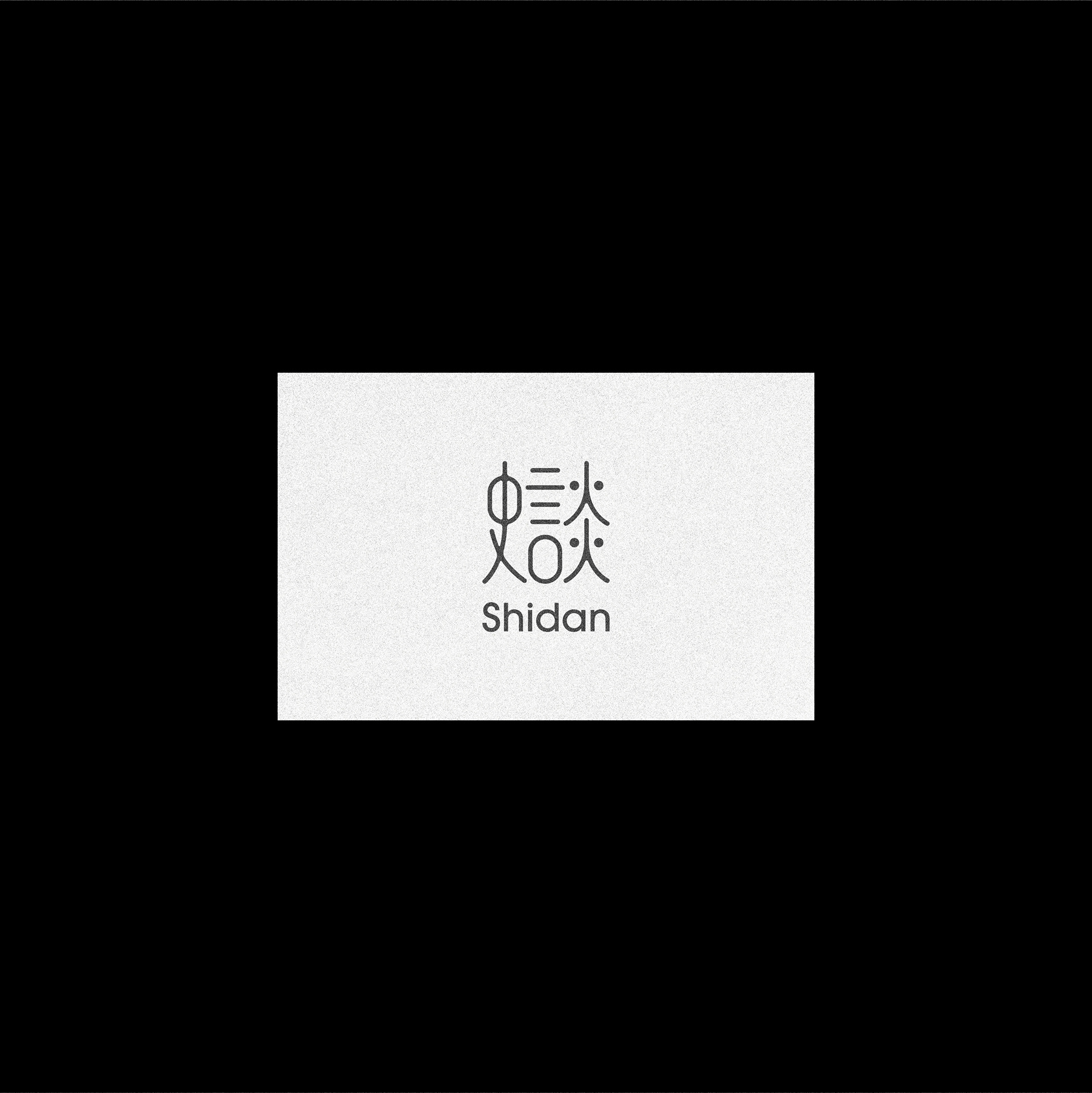
‘Shidan,’ a local history group in Matsumoto, Japan, is built on the values of connection and context. The new wordmark reinterprets Chinese characters into a flowing, structured form, symbolizing ongoing dialogue and shared memory. More than typography, it expresses the group’s identity and purpose, with clarity and balance suited for print, signage, and events.
‘시단’은 일본 마츠모토의 지역 역사 동호회로, ‘연결’과 ‘맥락’을 기반으로 활동합니다. 워드마크는 한자의 재구성을 통해 흐름 있는 구조를 만들었으며, 이들의 철학과 정체성을 담아냈습니다. 인쇄물과 간판, 행사 등 다양한 매체에 어울리도록 명확성과 균형감을 고려했습니다.