How Are Regions Get Branded 2
Editorial Design
Editorial Design
Category
Local, government branch, Book
Scope of Work
Editorial Design, Infographic Design, Photography
Local, government branch, Book
Scope of Work
Editorial Design, Infographic Design, Photography
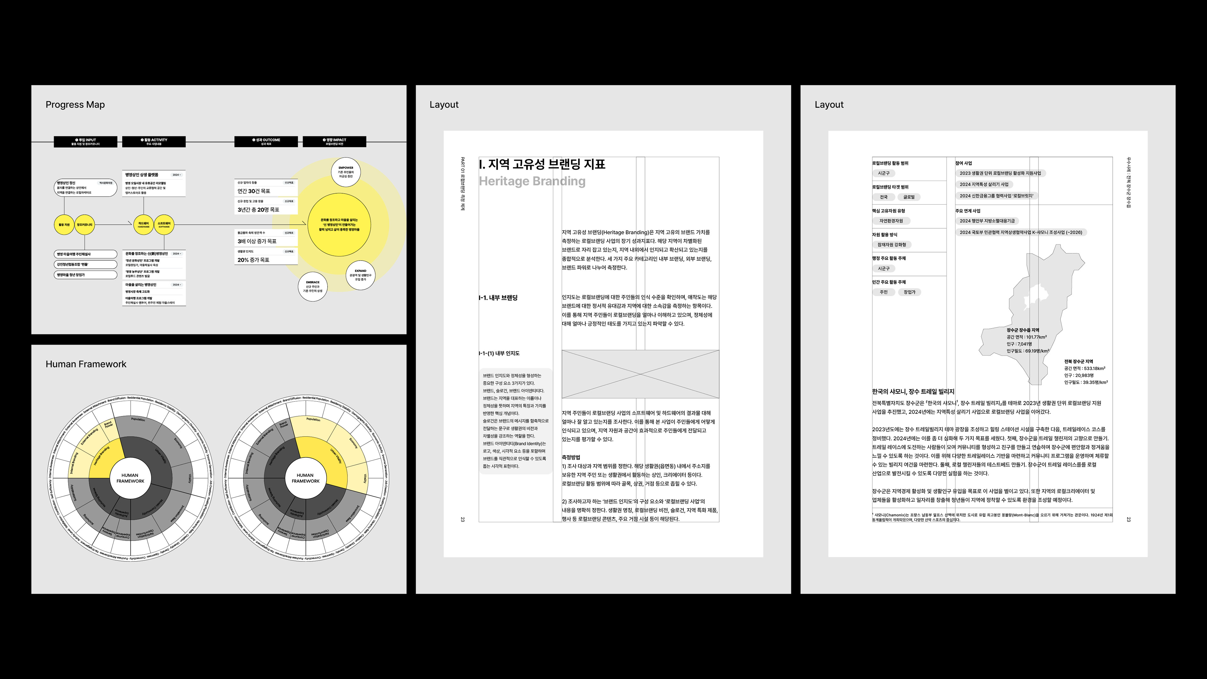
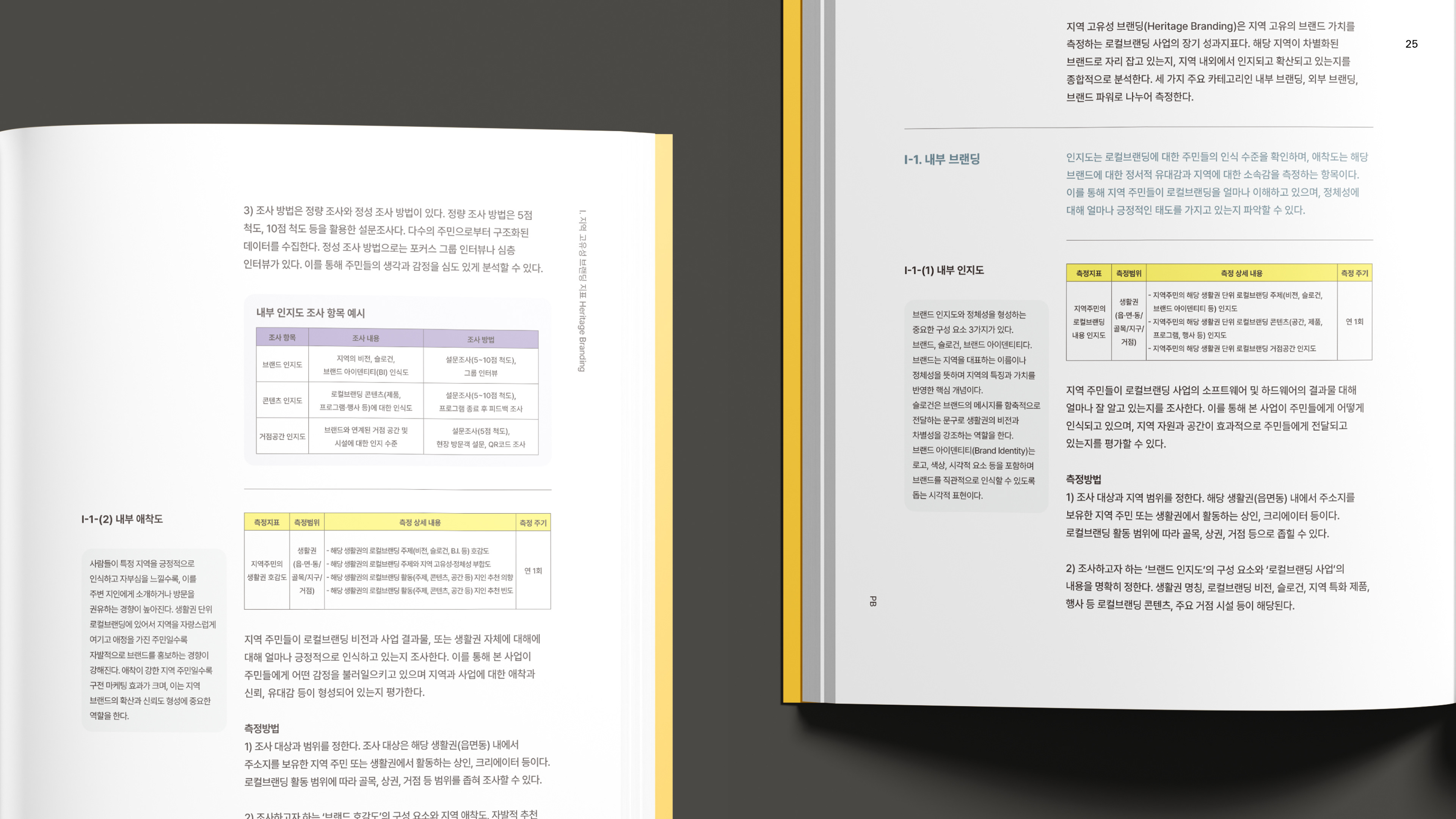
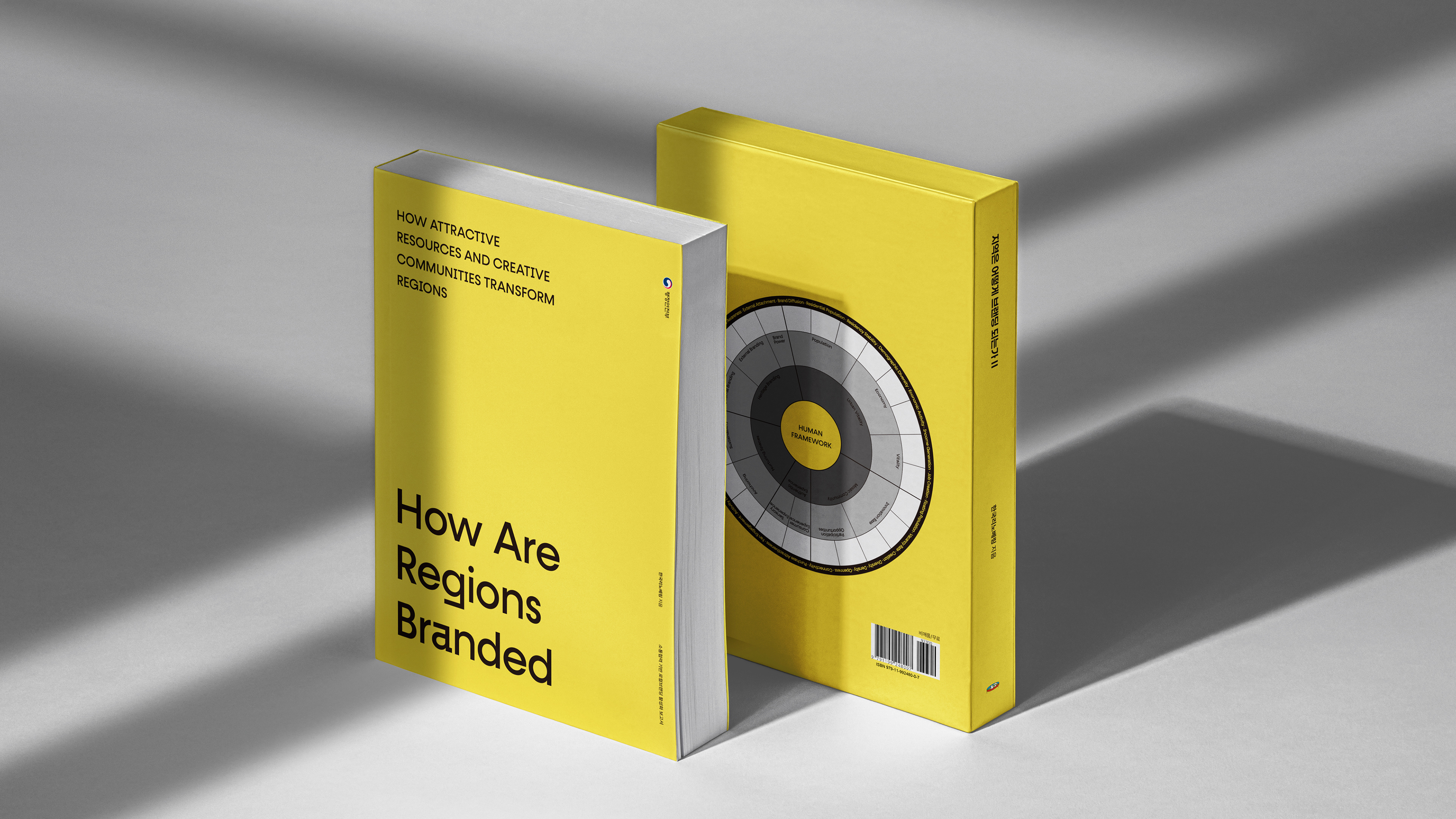
The visual design was guided by key principles: clarity, relational flow, informational hierarchy, and reusability. Rather than presenting isolated data points, the layout was structured to support intuitive understanding, contextual comparison, and process-driven reading.
지역은 어떻게 브랜딩 되는가2 아카이브북의 시각화는 이해도, 연결성, 정보 간의 위계 구조, 그리고 반복 사용 가능성을 핵심 기준으로 기획했습니다. 지표와 과정, 인터뷰를 단순히 나열하는 것이 아니라, 독자가 직관적으로 흐름을 읽고 비교하며 해석할 수 있는 구조로 설계했습니다.
지역은 어떻게 브랜딩 되는가2 아카이브북의 시각화는 이해도, 연결성, 정보 간의 위계 구조, 그리고 반복 사용 가능성을 핵심 기준으로 기획했습니다. 지표와 과정, 인터뷰를 단순히 나열하는 것이 아니라, 독자가 직관적으로 흐름을 읽고 비교하며 해석할 수 있는 구조로 설계했습니다.